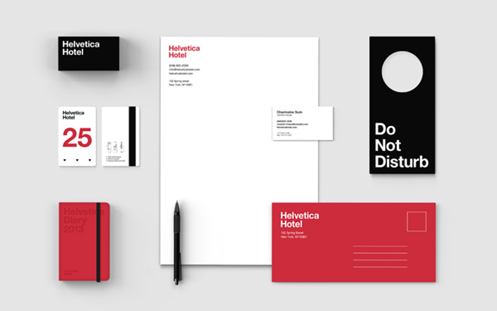
Today, it is almost a shock to see the sort of striking minimalist design that was probably most associated with Massimo Vignelli in the Sixties. It is a reminder that a simple typographic system and color palette, expertly used, can hit you right between the eyes a lot more effectively than many of the graphic gymnastics we are now more familiar with. This Helvetica Hypothesis, by designer Jung Hwan shows how it works.
Category: Ephemera

As part of the Dream Library Project, a series of mini-libraries for the New York Public School System, sponsored by McGraw-Hill and in association with Helpern Architects, we developed a series of animal forms created entirely out of typographic characters. These AlphaPets (we have about thirty to date) are designed to act as a learning stimulus for young schoolchildren. They are intended to be installed on hanging ceiling baffles and other components within the library spaces: a low-cost solution for creating a stimulating learning environment. Designers Saki Tanaka and Millie Lin in our studio were responsible for most of these and for pretending that it was hard work.
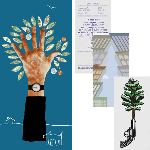
“The Urban Forest Project presents the work of 185 celebrated (that’s nice) designers, artists, illustrators and photographers from 21 countries. Each banner uses the form of a tree, or a metaphor for the tree, to make a powerful visual statement. Together they create a forest of thought-provoking images at the crossroads or the World, one of the planet’s busiest, most energetic and emphatically urban intersectionsâ€.
So reads the official introduction to the Urban Forest banner project, just installed in and around Times square. We are proud to have been invited to design one of the banners. Our banner is located on the North side of 41st Street at 6th Avenue, facing directly onto Bryant Square, by coincidence in the same block as my old penthouse studio at 42nd and Broadway. We have also included three favorites by other designers, from top to bottom: Walker Art Center, Donna David, and Seymour Chwast.
Following their display in and around Times Square, during September and October, the banners will be recycled into tote bags and be sold at auction. You can find out where and how at the Urban Forest website, where you can also order some nifty tee-shirts.

Medicine bottles are stupid and dumb. So are regulatory traffic signs, remote controls, cell phone interfaces, and the flushing mechanisms in toilets. Occasionally designers are hired to make them beautiful and dumb. Once in a blue moon, designers get it right. The new Target medicine bottle is one of those brilliant designs which make so much sense everyone must now be wondering why medicine bottles weren’t always like that. It is also great-looking, not through styling but as a result of good old form-follows-function clarity. Designed by Deborah Adler, an SVA student (who now works for Milton Glaser), as her thesis project, the new bottle sits cap downward to provide a large flat surface for clear graphics, features a pull-out card for personal and cautionary information, and is provided with changeable color-coded neck rings to distinguish drugs intended for different family members. Why is it so difficult for manufacturers to apply this kind of common-sense good design to all of those other infuriating objects that constantly frustrate us?
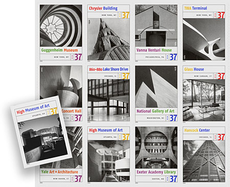
The Post Office have just released this series of Masterworks of American Architecture stamps, which is nice, although the cropping of most of the images leaves little of the architecture to appreciate. Particularly egregious is the fact that they cropped out our graphics for Richard Meier’s High Museum. We have solved that by redesigning that particular stamp for you (go on, you can see our graphics if you look hard enough). If you want to see more…
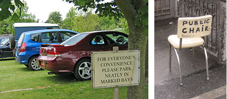
Photographed last month, just outside Chichester (UK) and in Greenwich Village (NY).
Wrong Mail
