Categories
Design Everyday

Eleven Times Square

Eleven times Square

Fourth in a series of major Times Square Office signage and wayfinding programs we have completed, a fifty-foot illuminated beacon identifies FXFowle’s Eleven Times Square. A comprehensive signage program including this beacon and the Subway station on 42nd Street are all part of this new development. Despite its Times Square address, it actually sits on Eighth Avenue immediately north of the New York Times building. See more details in our Projects section.

Categories
Culture Design Ephemera Fonts Geekery Opinions Usability

Helvetica Hotel

Helvetica Hotel

Today, it is almost a shock to see the sort of striking minimalist design that was probably most associated with Massimo Vignelli in the Sixties. It is a reminder that a simple typographic system and color palette, expertly used, can hit you right between the eyes a lot more effectively than many of the graphic gymnastics we are now more familiar with. This Helvetica Hypothesis, by designer Jung Hwan shows how it works.

Categories
Culture Design Usability

Harry Beck Redux

TubeMap2TubeMap1

For years now, Harry Beck’s 1931 angular London Transport tube map has been the seminal example of how to diagram transport systems. However, the system is much more complex now than when it began and designer Jonathan Fisher has responded to the resultant cartographic complication by suggesting a map based on the more conceptual idea of radial and circular lines, which is more how you tend to think of your travel in London. Interestingly, Harry beck also did some initial sketches which showed that a similar concept had also crossed his mind. Above, we compare the new suggestion with the familiar existing layout.

Categories
Culture Design Fonts

Concentricity

ConcentricTypeforms

In 1968, our colleague and Wyman/Whitehouse partner Lance Wyman created the now-famous Mexico Olympics logotype. So memorable it has become the de facto logotype for the country in many instances. This typeform was informed by the concentric structure seen in Huichol wool thread panels and spiral Pre-Columbian stone carvings. At the TEDx conference in San Miguel de Allende this year, the theme of the conference Future Now was titled by designer Lynn Rawden in Ideoma Liner, a typeface designed by the Ideoma Communications Agency, a new typographic interpretation of this cultural reference and an exciting continuation of the theme.

Categories
Culture Design Everyday

TEDx San Miguel de Allende

TEDxSMA2013

This year’s TEDx in San Miguel was packed to the gills, and predominantly with young people, many of them local students. Here, Xavier Fux speaks of Urban Agriculture as a promising strategy for the new Millennium. Other contributors included Sara Hoch, who has successfully dedicated herself to the revival of the Mexican film industry, and, as Director of the Guanajuato International Film Festival, is responsible for an extensive new headquarters for GIFF here in San Miguel, construction of which will begin in January, and which will include two auditoriums and extensive film, video, and sound production and post-produchtion facilities.

Categories
Software

Ghost – A Blogging Platform

Ghost Screeenshot

At Whitehouse & Company we believe in Open Source technology. We use WordPress for almost every website we design as it is a rock solid CMS which allows our clients to actually use their websites to interact with audiences, rather than create static experiences.

WordPress started, back in 2003 when we were still using the free blogging system Movable Type. Unfortunately in 2004 Movable type decided to tighten their licensing and start charging for use of their software and stop distributing a free version. This fundamental change made us jump ship and swim over to WordPress, which at that point was a huge switch in our process. We had never fooled around with PHP and having to learn, albeit superficially, a programming language was a huge undertaking for busy graphic designers. Movable Type later realized the error of their ways and created a free version for personal use, but by that point it was too late, we were addicted to the open source WordPress. Almost 10 years later we are still happy WordPress users and have donated, on behalf of ourselves and clients, hundreds of dollars to the application’s development.

However, WordPress is now arguably more CMS than blog software. For our client’s professional sites, this is a good thing, but when you compare WordPress to the ease of use of Tumblr for blogging, it falls short. It lacks the “get out of your way” mentality that Tumblr uses to spotlight content and spur conversation. WordPress is a wonderful website creation tool, but as a blogging system — it is a little overwhelming for a quick post. Tumblr, however, is not open source, nor can it be hosted on your own server and the content owned exclusively by you.

Ghost Kickstarter screenshot

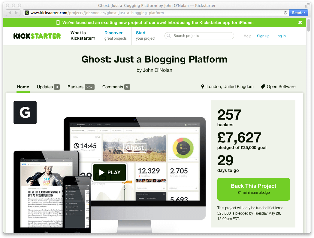
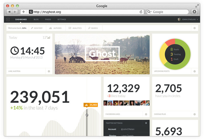
In light of this, and in the interest of supporting options in the Open Source community, today we have backed the Kickstarter campaign for Ghost, a new platform for blogging. It looks both beautifully designed and elegant. Best of all, Ghost will be free (if fully funded) for anyone to try, use, experiment and most importantly — express themselves.

Give it a look, and if you agree with their mission, donate a few pounds… they’re English.

Update

Even in the short space of time from yesterday to today, the Kickstarter has rocketed from £7,000 when we funded it, to an impressive £45,000. So it looks like Ghost will be a successful reality for everyone. They are still raising money and if they raise enough they will add benefits to supporters. Go help them out if you haven’t already.

Categories
Web

Website Update, Part 2 (a Year Later)

Website Update Part 2

Website redesigns are hard — especially your own. Sure we can create websites for our clients over a coffee-infused weekend, but having yourself as a client? Well, that can be plain crippling. It ultimately comes down to wanting to make the best product possible, but when you are working for yourself often ideas multiply and before you know it, you are redesigning the browser instead of your website.

Ultimately the best incentive for a website launch is to say “We are going to launch our site on X day” and stick to it. Regardless of if the design is finished, launch the site. What is the worst that can happen? Well, I guess it could Titanic on you, and all aboard could be sent sprawling into the cold seas of the information superhighway. Or more realistically, the worst that can happen is visitors see an unfinished product. At least they are seeing something, and having your incomplete site “live” is the best incentive to get it done.

“It’s easier to ask forgiveness than it is to get permission.”

– Grace Hopper

And so, just shy of a year of our original post, we finally launch the second major iteration of our website in its almost completed form. Feel free to head up to the observation deck, but be careful leaning over the railings, they are a little loose.

Categories
Web

Website Update

The original site – for posterity.

Back in 2002, the web was a fairly volatile place. Web standards had just been introduced, and the internet was in flux with new coding strategies and methodologies. Since 2002 we have seen incredible advances in both the way websites are made as well as a substantial change in what they are made out of.

This website was originally designed in 2002. It was, at the time, pretty cutting edge using WordPress as its internal content management system. Now in 2012, that is standard practice for most websites on the internet. As such we have decided at Whitehouse & Company to redesign using the latest standards, HTML5 and CSS3. To bring our blog and portfolio into the twenty-teens.

It is something we are very excited about and a journey we will share in posts about what we learn along the way.

Categories
Events Geekery

2010 SEGD Twitter Updates

If you can’t make it to the SEGD national conference this year or want to see what we are up up to in D.C., you might want to follow the Whitehouse & Company Twitter feed. We’ll be updating throughout the event and bringing our unique view of the show.

There will also be tons of spelling errors, because there is no spell check on the iPhone, so you’ll have that to look forward to as well.

Let’s get environmental.

Categories
Web

ASISTS Web Design

We have recently put the finishing touches on a web appliction for the New York State Department of Education. Developed in association with the Literacy Assistance Center in New York, the ASISTS site allows teachers to record the progress and history of students, and to be able to access this information and update it at any location. Being database driven, it can automatically prepare statistical analyses within any specified parameters, for reporting purposes.

Literacy Assistance Center ASISTS

For the technically minded, the site features:

  • XHTML Strict compliance
  • CSS Styled
  • Cross browser compatibility
  • Small bandwidth footprint

All of which means that it is state-of the-art, as well as having a clear graphic hierarchy to enable users to easily navigate and understand this otherwise complex and extensive site.