Categories
Culture Design Everyday

Rancho Mirage Museum Completed

Children's Mueum Complete

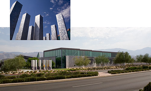
The first phase of our work at the Children’s Discovery Museum of the Desert project is now completed. The aluminum shafts display the Museum’s logotype, which assembles itself visually on the pylons as you enter the site. The mural (described in the entry for 23 January, below) features 4,000 tiles to which donors portraits are continually being added, eventually aggregating into an image representing the supporting community and America’s diversity. Due to the success of the project, MGA Partners, who are the architects of this superb building, are now working on the extension of the Museum.

Categories
Culture Design Events Everyday Usability

Children-Friendly Acessible Hospital Signs

adccombo1.jpg

We recently completed this sign system for a Children’s Hospital using photo pictograms for both wayfinding and destination signs to create an accessible and children friendly environment. The system builds on our work with Lighthouse International in New York and features a tactile ledge which is easily located by sight-impaired users, and a new typeface developed by our studio to facilitate tactile reading. Both the sign system and typeface were featured in Roger Whitehouse’s keynote presentation to the International Conference on Universal Design in Kyoto in November.

Categories
Design Everyday

Ozella’s Code. A Front Page Controversy

fdccombo.jpg

In today’s Times, it is reported that part of the extensive graphics we have designed for the new monument being constructed at Frederick Douglass Circle, have become the center of a heated controversy. Beneath an eight-foot-tall sculpture of Douglass, by Gabriel Koren, the plans call for a huge quilt in granite, by Algernon Miller, who designed the memorial site, each geometrical element supposedly part of a secret code sewn into family quilts and used along the Underground Railroad to aid slaves in their escape North to freedom. As part of the project, we had prepared a design for a bronze and colored enamel plaque displaying this. Unfortunately, it appears that the basis for this theory, known as Ozella’s Code, published in the book Hidden in Plain View, by Jacqueline Tobin, and much publicized on the Oprah Winfrey show, is now being challenged as potentially bogus. You can read the full account via the Times link above. In the meantime, I guess we better dust off our computer files, and wait for further developments.

Categories
Culture Design Everyday

Some Things Never Change

tsqcombo.jpg

Ten years ago, when we worked on the graphics with Fox & Fowle (now FXFowle) for their new Subway station in Times Square at Broadway and 42nd Street, we had the Times Square Brewery and a half-size Concorde on our shoulders. Today, we have an entire 50 storey tower and some nifty Target advertising. In fact, the graphics were recreated for the new building replicating the original design. I think that means our client may be pleased with what we came up with. We are proud to say that it appears that the Municipal Art Society were, as the signage has been honored with their blue ribbon award. More information can be seen on our project pages.

Categories
Books Culture Design Ephemera Everyday Fonts

Dream Library “AlphaPets”

alphapets2.jpg

As part of the Dream Library Project, a series of mini-libraries for the New York Public School System, sponsored by McGraw-Hill and in association with Helpern Architects, we developed a series of animal forms created entirely out of typographic characters. These AlphaPets (we have about thirty to date) are designed to act as a learning stimulus for young schoolchildren. They are intended to be installed on hanging ceiling baffles and other components within the library spaces: a low-cost solution for creating a stimulating learning environment. Designers Saki Tanaka and Millie Lin in our studio were responsible for most of these and for pretending that it was hard work.

Categories
Culture Design Everyday

Sake Barrels and Torli Gates

hiesake.jpg

hietorli.jpg

The shrines and temples of Japan abound with iconic views, in this instance a wall of Sake barrels, used as part of purification rituals, and an avenue of Torli gates, at the Shinto Hie Shrine in Tokyo.

Categories
Culture Design Everyday

Fukuoka Subway: On the Right Track

fukuoka1.jpg

One of the delights of being invited to conferences is meeting new colleagues and discovering their work. This was particularly the case in Kyoto in October, where among many new introductions, I met Toshimitsu Sadamura, the designer of the new Fukuoka City Subway, Nanakuma LIne. This ten-year project puts other subway systems to shame for its clarity of vision and depth of attention to detail. Spectacular in every aspect, it is its accessibility that it particularly impresses. Universal design concepts have been integtated effortlessly (for the user, not the designer) into every aspect of its design. One can only give a glimpse of what has been achieved in these four photographs, but the project is well illustrated in Toshimitsu’s publication A Universal Design for Public Transportation. Sadly, this book is not available on any English language websites, but you may be able to get a copy by ordering in Japanese from the link above, or by contacting Toshimitsu’s company: GA-TAP.Inc.

fukuoka2.jpg

Categories
Culture Design Ephemera Events Everyday

A Banner Year

banner

“The Urban Forest Project presents the work of 185 celebrated (that’s nice) designers, artists, illustrators and photographers from 21 countries. Each banner uses the form of a tree, or a metaphor for the tree, to make a powerful visual statement. Together they create a forest of thought-provoking images at the crossroads or the World, one of the planet’s busiest, most energetic and emphatically urban intersections”.

So reads the official introduction to the Urban Forest banner project, just installed in and around Times square. We are proud to have been invited to design one of the banners. Our banner is located on the North side of 41st Street at 6th Avenue, facing directly onto Bryant Square, by coincidence in the same block as my old penthouse studio at 42nd and Broadway. We have also included three favorites by other designers, from top to bottom: Walker Art Center, Donna David, and Seymour Chwast.

Following their display in and around Times Square, during September and October, the banners will be recycled into tote bags and be sold at auction. You can find out where and how at the Urban Forest website, where you can also order some nifty tee-shirts.

Categories
Books Design Everyday Geekery

Official Signs and Icons 2

Symbols new

For those of us who have to deal with symbols and icons on a regular basis, and there can’t be many of us who don’t nowadays, Mies Hora’s new publication Official Signs and Icons 2 is a wonderful resource. It comes both as a book and a CD (containing outline EPS files) which you can buy separately or as a set.

In eleven chapters, it brings together in one volume, pretty much every symbol you will ever need to wrestle with, including highway and transportations signs, safety symbols, recreational symbols and some nerdy stuff for electronics, computers, meteorology, and labelling. Most fun is the chapter which shows each character of the alphabet in signal flags, semaphore positions, Morse code, American Sign Language, and Braille.

There have been several such books published from time to time since Henry Dreyfus’ 1972 Symbol Sourcebook, which still contains the most fascinating and esoteric selections, such as hobo signs. But for symbols with everyday applications, if you aren’t planning to jump a freight train, Mies has excelled himself in putting together this exhaustive collection (although I must admit I gave him a little help with some of those relating to accessibility).

Categories
Culture Design Everyday

Walking on Water

Bridges

Photographed in London last month, these two new footbridges over the Thames are very much worth checking out and have really made access to the newly developed South Bank of the Thames more inviting. The Millennium bridge, by architects Foster and Partners with sculptor Sir Anthony Caro ran into some early bouncing problems and was closed until the installation of monster shock absorbers. Leading directly from St. Paul’s to the Tate Modern and the Globe Theatre it provides some wonderful vantage points of the River and the City. The new Hungerford footbridges, one on each side of the rail bridge, by architects Lifschutz Davidson replace an old, dangerous, and creepy footbridge I often used during trips back and forth from the National Film Theatre when a student. Take the tube to St. Paul’s, walk over the MIlennium Bridge to the Tate Modern, then west along the embankment, and return to Trafalgar Square via the new Hungerford bridge (the west side is best). Great views and some stimulating modern design. All paid for by a publc lottery. Is this a way to go for paying for much needed public space improvements in the US?