Categories
Design Everyday

Eleven Times Square

Eleven times Square

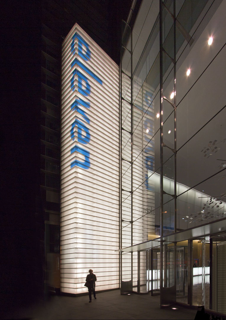
Fourth in a series of major Times Square Office signage and wayfinding programs we have completed, a fifty-foot illuminated beacon identifies FXFowle’s Eleven Times Square. A comprehensive signage program including this beacon and the Subway station on 42nd Street are all part of this new development. Despite its Times Square address, it actually sits on Eighth Avenue immediately north of the New York Times building. See more details in our Projects section.

Categories
Culture Design Ephemera Fonts Geekery Opinions Usability

Helvetica Hotel

Helvetica Hotel

Today, it is almost a shock to see the sort of striking minimalist design that was probably most associated with Massimo Vignelli in the Sixties. It is a reminder that a simple typographic system and color palette, expertly used, can hit you right between the eyes a lot more effectively than many of the graphic gymnastics we are now more familiar with. This Helvetica Hypothesis, by designer Jung Hwan shows how it works.

Categories
Culture Design Usability

Harry Beck Redux

TubeMap2TubeMap1

For years now, Harry Beck’s 1931 angular London Transport tube map has been the seminal example of how to diagram transport systems. However, the system is much more complex now than when it began and designer Jonathan Fisher has responded to the resultant cartographic complication by suggesting a map based on the more conceptual idea of radial and circular lines, which is more how you tend to think of your travel in London. Interestingly, Harry beck also did some initial sketches which showed that a similar concept had also crossed his mind. Above, we compare the new suggestion with the familiar existing layout.

Categories
Books

Union Station Washington

USW FingerboardsNewAnglelw

Working in association with Lance Wyman, we have recently completed the design phase of a wayfinding and branding system for Union Station Washington. After considerable research, and the creation of a detailed masterplan document, the key proposal of this difficult and complex project is an overhead light track and fingerboard system, clearly defining the major circulation routes, and providing directional information to a carefully chosen hierarchy of destinations.

Categories
Culture Design Fonts

Concentricity

ConcentricTypeforms

In 1968, our colleague and Wyman/Whitehouse partner Lance Wyman created the now-famous Mexico Olympics logotype. So memorable it has become the de facto logotype for the country in many instances. This typeform was informed by the concentric structure seen in Huichol wool thread panels and spiral Pre-Columbian stone carvings. At the TEDx conference in San Miguel de Allende this year, the theme of the conference Future Now was titled by designer Lynn Rawden in Ideoma Liner, a typeface designed by the Ideoma Communications Agency, a new typographic interpretation of this cultural reference and an exciting continuation of the theme.

Categories
Culture Design Everyday

TEDx San Miguel de Allende

TEDxSMA2013

This year’s TEDx in San Miguel was packed to the gills, and predominantly with young people, many of them local students. Here, Xavier Fux speaks of Urban Agriculture as a promising strategy for the new Millennium. Other contributors included Sara Hoch, who has successfully dedicated herself to the revival of the Mexican film industry, and, as Director of the Guanajuato International Film Festival, is responsible for an extensive new headquarters for GIFF here in San Miguel, construction of which will begin in January, and which will include two auditoriums and extensive film, video, and sound production and post-produchtion facilities.

Categories
Everyday

St. Paul’s, St. Paul’s

Some interesting illuminations in London photographed on my visit there with Ben this month. The inset shows St. Pauls in Covent Garden, known as the actor’s church – the Christmas tree silhouette, projected from the market building, is a great example of low-cost high-visibility environmental graphic design. When I was a student at the AA in the late 50’s, and when this was a real market, we often used to visit an all-night pie stall which lived on the right of the church entrance under the stained-glass window. The other image shows the more well known St. Pauls in the background, behind the National Theatre on the South Bank, whose lighting changes color from day to day. All different and festive examples of creative lighting design.

Categories
Everyday

About People

morningside.jpg

We recently completed this branding program, in association with DK Holland, for the Morningside Center for Social Responsisbility; a wonderful group who, among other things, foster conflict resolution in our school system. The use of an anthropomorphic M in the mark, and silhouettes in their outreach materials, underlines their core mission. Shown here are boxes for teaching aids for a range of grades, their website, and a bookmark.

Categories
Culture Design Everyday

Rancho Mirage Museum Completed

Children's Mueum Complete

The first phase of our work at the Children’s Discovery Museum of the Desert project is now completed. The aluminum shafts display the Museum’s logotype, which assembles itself visually on the pylons as you enter the site. The mural (described in the entry for 23 January, below) features 4,000 tiles to which donors portraits are continually being added, eventually aggregating into an image representing the supporting community and America’s diversity. Due to the success of the project, MGA Partners, who are the architects of this superb building, are now working on the extension of the Museum.

Categories
Culture Design Events Everyday Usability

Children-Friendly Acessible Hospital Signs

adccombo1.jpg

We recently completed this sign system for a Children’s Hospital using photo pictograms for both wayfinding and destination signs to create an accessible and children friendly environment. The system builds on our work with Lighthouse International in New York and features a tactile ledge which is easily located by sight-impaired users, and a new typeface developed by our studio to facilitate tactile reading. Both the sign system and typeface were featured in Roger Whitehouse’s keynote presentation to the International Conference on Universal Design in Kyoto in November.