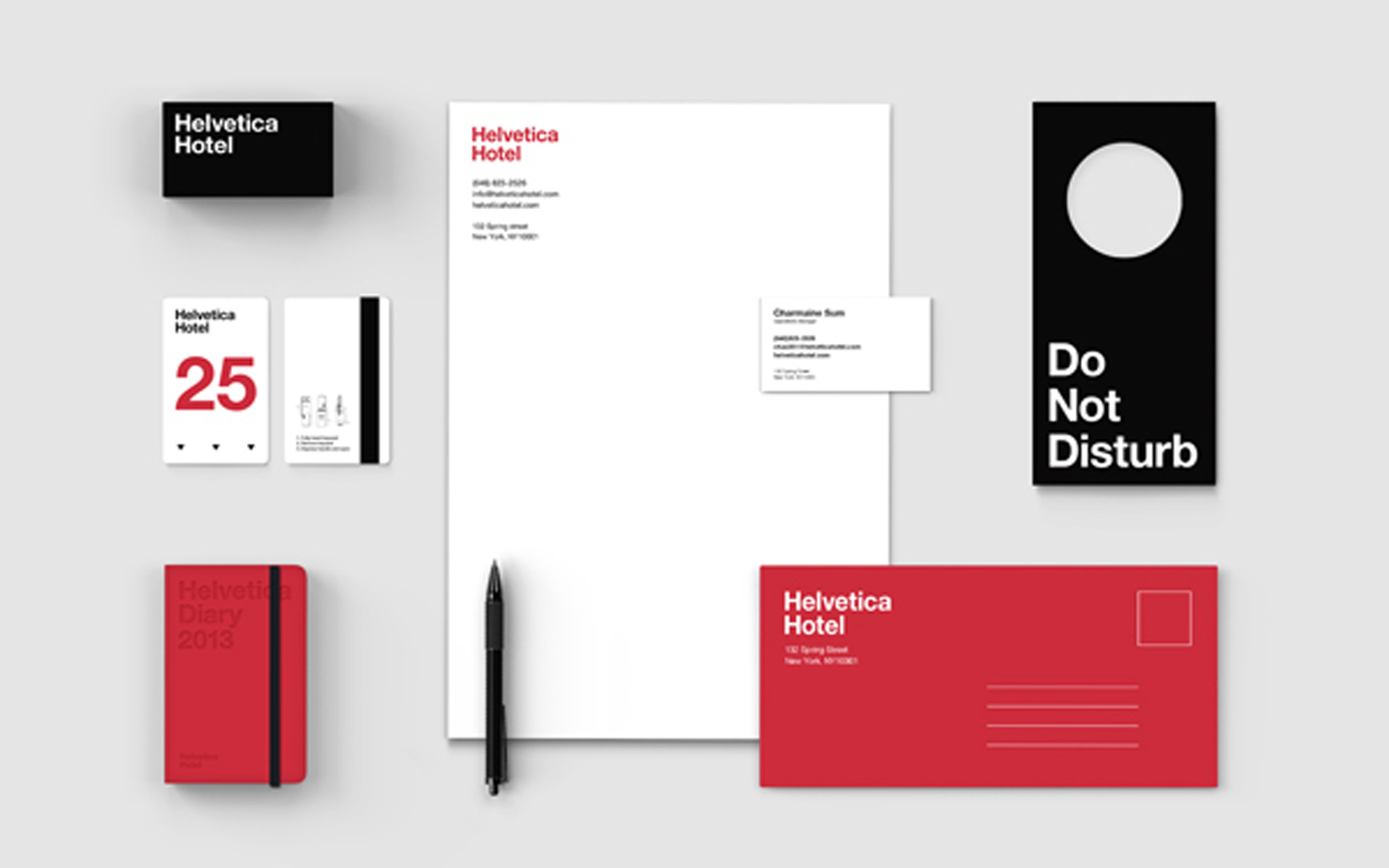
Today, it is almost a shock to see the sort of striking minimalist design that was probably most associated with Massimo Vignelli in the Sixties. It is a reminder that a simple typographic system and color palette, expertly used, can hit you right between the eyes a lot more effectively than many of the graphic gymnastics we are now more familiar with. This Helvetica Hypothesis, by designer Jung Hwan shows how it works.
Category: Usability
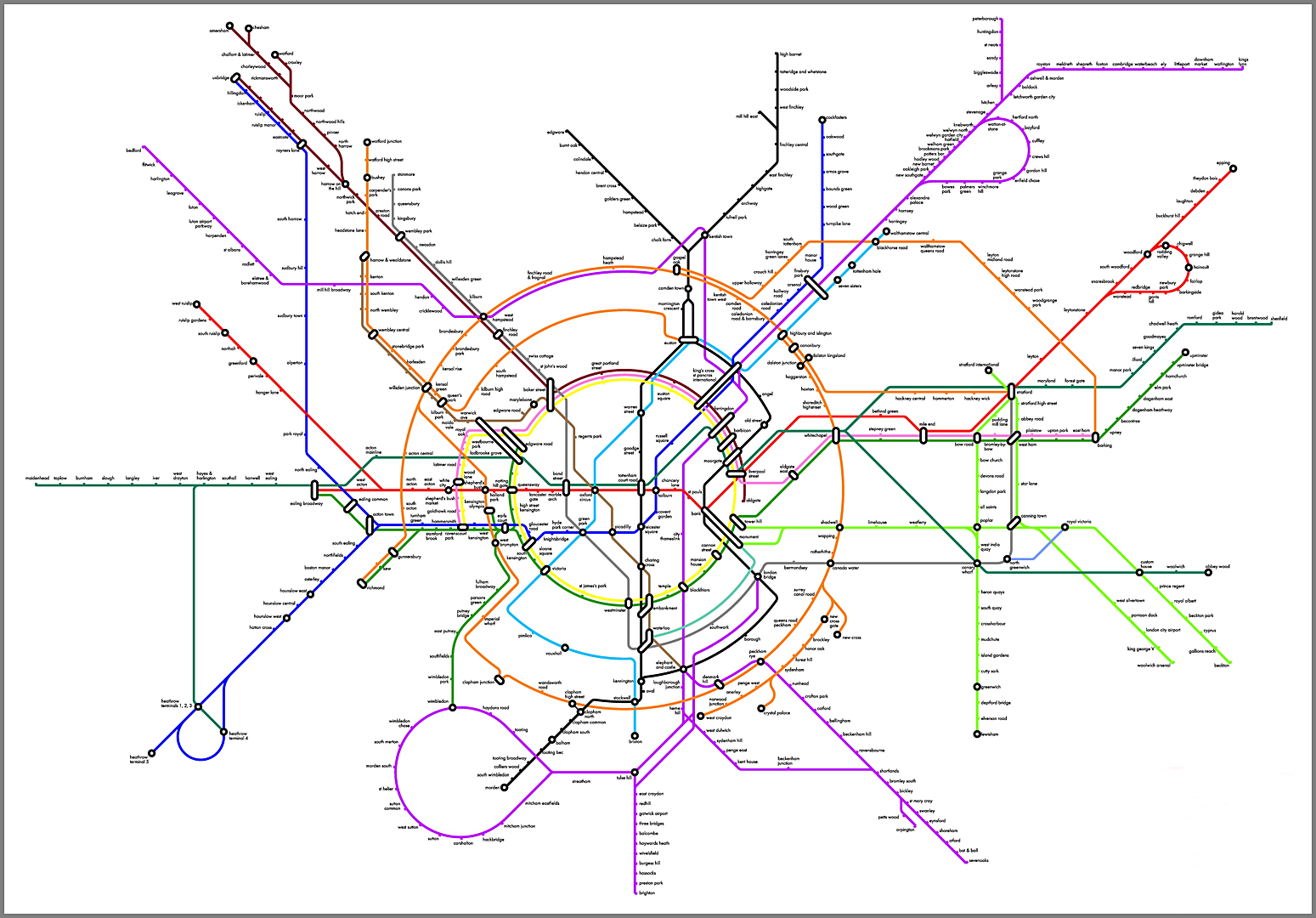
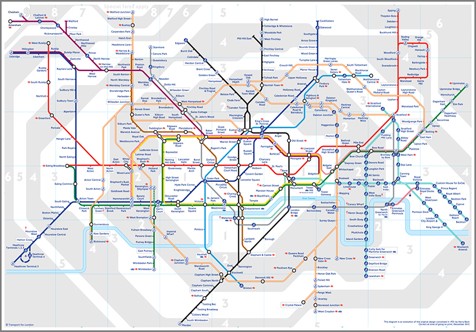
For years now, Harry Beck’s 1931 angular London Transport tube map has been the seminal example of how to diagram transport systems. However, the system is much more complex now than when it began and designer Jonathan Fisher has responded to the resultant cartographic complication by suggesting a map based on the more conceptual idea of radial and circular lines, which is more how you tend to think of your travel in London. Interestingly, Harry beck also did some initial sketches which showed that a similar concept had also crossed his mind. Above, we compare the new suggestion with the familiar existing layout.

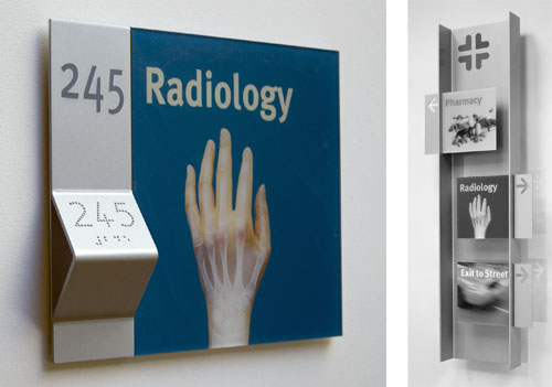
We recently completed this sign system for a Children’s Hospital using photo pictograms for both wayfinding and destination signs to create an accessible and children friendly environment. The system builds on our work with Lighthouse International in New York and features a tactile ledge which is easily located by sight-impaired users, and a new typeface developed by our studio to facilitate tactile reading. Both the sign system and typeface were featured in Roger Whitehouse’s keynote presentation to the International Conference on Universal Design in Kyoto in November.


