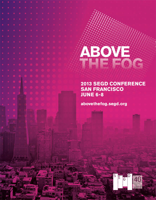
While I head off into the sunset to the 2013 SEGD conference in San Francisco, the New York studio will be manned by Roger and staff to answer all pressing client issues. I’m excited to be back in San Francisco – one of my favorite best coast cities. Unlike Los Angeles, San Francisco understands what it is to live in a city with occasional crappy weather. Call it what you will, it makes the citizens a much more relatable bunch than those farther south, who can’t truly appreciate the urgency to enjoy good weather.
Category: Events
Design & the Senses
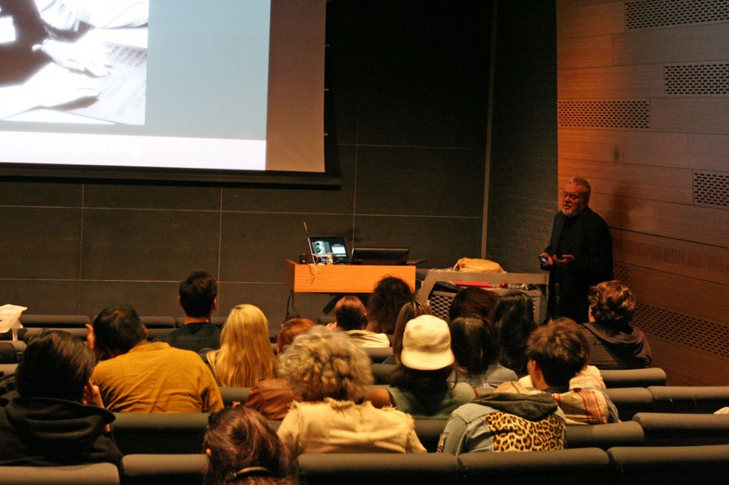
Today Roger Whitehouse spoke to current students and faculty at Parsons School of Design in New York City. He discussed how lessons learned at The Lighthouse project, in New York, were invaluable to understanding that perceptions on how people encounter spatial environments are not universal.
If you can’t make it to the SEGD national conference this year or want to see what we are up up to in D.C., you might want to follow the Whitehouse & Company Twitter feed. We’ll be updating throughout the event and bringing our unique view of the show.
There will also be tons of spelling errors, because there is no spell check on the iPhone, so you’ll have that to look forward to as well.
Let’s get environmental.
Packing up for 2010 SEGD Conference
Whitehouse & Company will be closed during the 2010 SEGD National Conference down in Washington D.C. June 2nd – June 5th. We hope to see you there and please feel free to say hello to Ben or Roger.
We will also be live tweeting during the conference, so please be sure to check back to find out what find interesting in our nations capital.
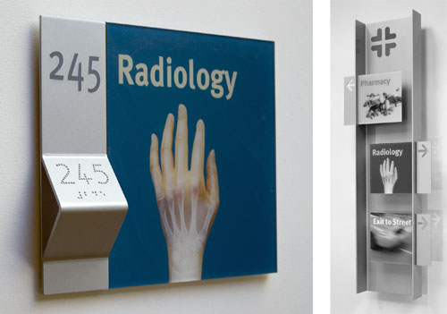
We recently completed this sign system for a Children’s Hospital using photo pictograms for both wayfinding and destination signs to create an accessible and children friendly environment. The system builds on our work with Lighthouse International in New York and features a tactile ledge which is easily located by sight-impaired users, and a new typeface developed by our studio to facilitate tactile reading. Both the sign system and typeface were featured in Roger Whitehouse’s keynote presentation to the International Conference on Universal Design in Kyoto in November.
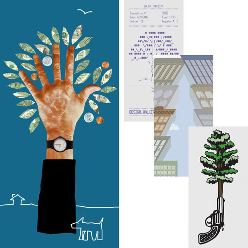
“The Urban Forest Project presents the work of 185 celebrated (that’s nice) designers, artists, illustrators and photographers from 21 countries. Each banner uses the form of a tree, or a metaphor for the tree, to make a powerful visual statement. Together they create a forest of thought-provoking images at the crossroads or the World, one of the planet’s busiest, most energetic and emphatically urban intersectionsâ€.
So reads the official introduction to the Urban Forest banner project, just installed in and around Times square. We are proud to have been invited to design one of the banners. Our banner is located on the North side of 41st Street at 6th Avenue, facing directly onto Bryant Square, by coincidence in the same block as my old penthouse studio at 42nd and Broadway. We have also included three favorites by other designers, from top to bottom: Walker Art Center, Donna David, and Seymour Chwast.
Following their display in and around Times Square, during September and October, the banners will be recycled into tote bags and be sold at auction. You can find out where and how at the Urban Forest website, where you can also order some nifty tee-shirts.
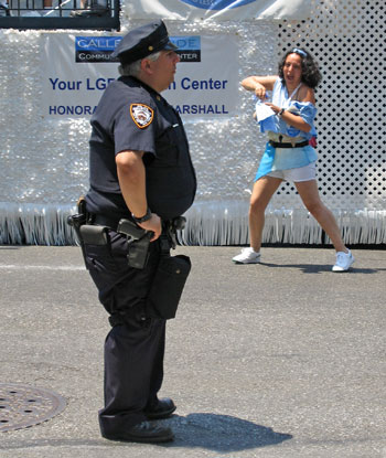
A participant, and a traditionally shaped New York City cop (I didn’t know there were any of these left), festooned with genuine good old-fashioned cop paraphernalia. Taken during today’s gay pride parade just along from our studio, at Fifth Avenue and 16th Street. Hillary Clinton got the biggest applause.
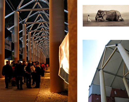
Having seen the elephant photo all over the place for some time, Saki and I hurried over to Pier 54 to have a look at Ashes and Snow for ourselves before it closed and were amazed. What most impressed was Shigeru Ban’s structure. I was expecting a pile of shipping containers with some photos on the wall. Instead I found one of the most exciting and awe inspiring spaces that New York has ever had to offer, and like the Central Park Gates project, it wasn’t around for long (it is now all being shipped to California). First of all, this thing is huge! On entering you found yourself in a fabulous, dark, ethereal, and seemingly endless cathedral space stretching a full City block out into the Hudson. While constructed of shipping containers, sonotubes, canvas, and steel cable, with a floor of wooden planks and river stones, it has all the authority and majesty of any cathedral nave you have ever visited. Truly wonderful and a must-visit if you encounter it on your travels.
The photos I was less enthusiastic about. While there is no denying that many of these images are stunning, the more I saw the more I felt uneasy about the apparently contrived posing and what to me seemed an intrusively “arty” presentation. If these had been paintings (which they nearly are) I think they would seem the epitome of Shmaltz and the fact that they are photos does not ultimately redeem them in this respect. One would love to think that the child had innocently happened upon the elephant and stopped to consider it, and that the photographer had innocently (or purposely) happened upon both. But that not being the case what we end up with seems somewhat unsubstantial.
But that’s just my opinion. Do not miss out on the chance to see for yourself.