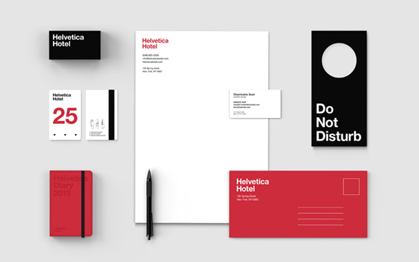
Today, it is almost a shock to see the sort of striking minimalist design that was probably most associated with Massimo Vignelli in the Sixties. It is a reminder that a simple typographic system and color palette, expertly used, can hit you right between the eyes a lot more effectively than many of the graphic gymnastics we are now more familiar with. This Helvetica Hypothesis, by designer Jung Hwan shows how it works.
Category: Fonts
In 1968, our colleague and Wyman/Whitehouse partner Lance Wyman created the now-famous Mexico Olympics logotype. So memorable it has become the de facto logotype for the country in many instances. This typeform was informed by the concentric structure seen in Huichol wool thread panels and spiral Pre-Columbian stone carvings. At the TEDx conference in San Miguel de Allende this year, the theme of the conference Future Now was titled by designer Lynn Rawden in Ideoma Liner, a typeface designed by the Ideoma Communications Agency, a new typographic interpretation of this cultural reference and an exciting continuation of the theme.

As part of the Dream Library Project, a series of mini-libraries for the New York Public School System, sponsored by McGraw-Hill and in association with Helpern Architects, we developed a series of animal forms created entirely out of typographic characters. These AlphaPets (we have about thirty to date) are designed to act as a learning stimulus for young schoolchildren. They are intended to be installed on hanging ceiling baffles and other components within the library spaces: a low-cost solution for creating a stimulating learning environment. Designers Saki Tanaka and Millie Lin in our studio were responsible for most of these and for pretending that it was hard work.

