As part of the Dream Library Project, a series of mini-libraries for the New York Public School System, sponsored by McGraw-Hill and in association with Helpern Architects, we developed a series of animal forms created entirely out of typographic characters. These AlphaPets (we have about thirty to date) are designed to act as a learning stimulus for young schoolchildren. They are intended to be installed on hanging ceiling baffles and other components within the library spaces: a low-cost solution for creating a stimulating learning environment. Designers Saki Tanaka and Millie Lin in our studio were responsible for most of these and for pretending that it was hard work.

Category: Everyday
Everyday type things
Remember the Good Old Days?
It is presently 70 degrees (21 Celcius) in New York. Just a reminder of what it should look like at this time of the year. (I took this picture three years ago on January 20th in the Rambles in Central Park. It shows the early morning sun striking the Dakota apartment building at 72nd Street, with the steeply-pitched roofs, so named because when it stood there alone when it was built in 1893 living there was considered to be so far out of town, folks said “it might as well be in the Dakotas.”)
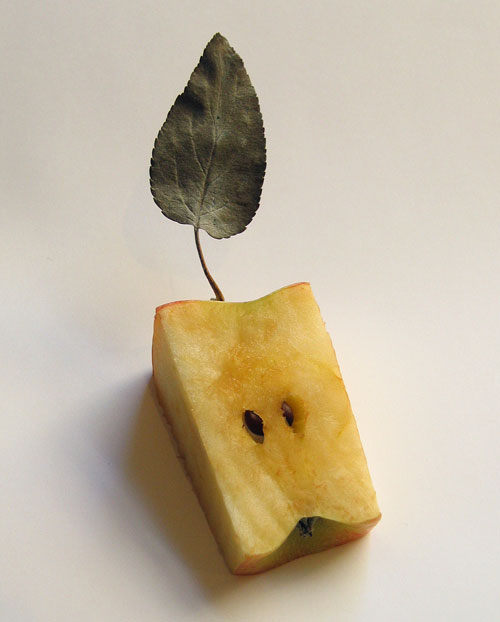
Accidental Appleman
We were all slicing away at an apple from the Union Square Market during lunch today when we looked down and discovered we had created, quite unintentionally, this inscrutable appleperson. What a nice way to begin the year. Serendipity Rules.
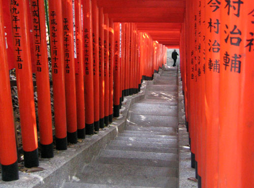
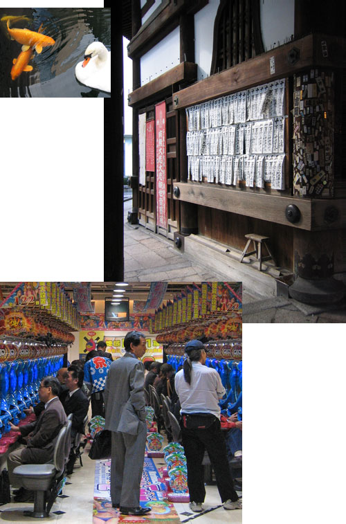
The shrines and temples of Japan abound with iconic views, in this instance a wall of Sake barrels, used as part of purification rituals, and an avenue of Torli gates, at the Shinto Hie Shrine in Tokyo.
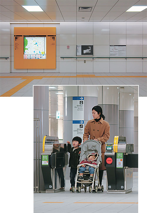
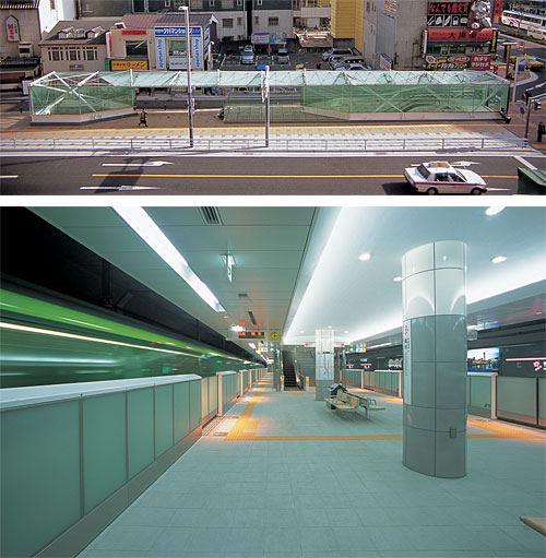
One of the delights of being invited to conferences is meeting new colleagues and discovering their work. This was particularly the case in Kyoto in October, where among many new introductions, I met Toshimitsu Sadamura, the designer of the new Fukuoka City Subway, Nanakuma LIne. This ten-year project puts other subway systems to shame for its clarity of vision and depth of attention to detail. Spectacular in every aspect, it is its accessibility that it particularly impresses. Universal design concepts have been integtated effortlessly (for the user, not the designer) into every aspect of its design. One can only give a glimpse of what has been achieved in these four photographs, but the project is well illustrated in Toshimitsu’s publication A Universal Design for Public Transportation. Sadly, this book is not available on any English language websites, but you may be able to get a copy by ordering in Japanese from the link above, or by contacting Toshimitsu’s company: GA-TAP.Inc.
Three images taken in Tokyo during my visit to Japan last month to make a presentation as a keynote speaker at the Universal Design Conference in Kyoto. More to follow.
Late For Work Again
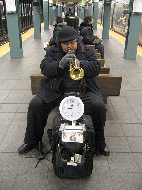
You don’t often think of public support of the Arts in the context of street entertainers, but the MTA is to be lauded for encouraging much of what is heard in the Subway system. As a result, over the years I have often arrived at work a little later than intended, although this horn player certainly cannot be held responsible for my not knowing what time it was. Taken this morning on the R train platform at Times Square.
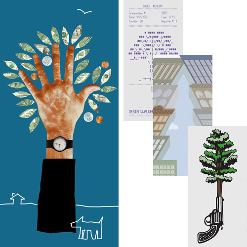
“The Urban Forest Project presents the work of 185 celebrated (that’s nice) designers, artists, illustrators and photographers from 21 countries. Each banner uses the form of a tree, or a metaphor for the tree, to make a powerful visual statement. Together they create a forest of thought-provoking images at the crossroads or the World, one of the planet’s busiest, most energetic and emphatically urban intersectionsâ€.
So reads the official introduction to the Urban Forest banner project, just installed in and around Times square. We are proud to have been invited to design one of the banners. Our banner is located on the North side of 41st Street at 6th Avenue, facing directly onto Bryant Square, by coincidence in the same block as my old penthouse studio at 42nd and Broadway. We have also included three favorites by other designers, from top to bottom: Walker Art Center, Donna David, and Seymour Chwast.
Following their display in and around Times Square, during September and October, the banners will be recycled into tote bags and be sold at auction. You can find out where and how at the Urban Forest website, where you can also order some nifty tee-shirts.
Children’s Museum Mural Nears Completion
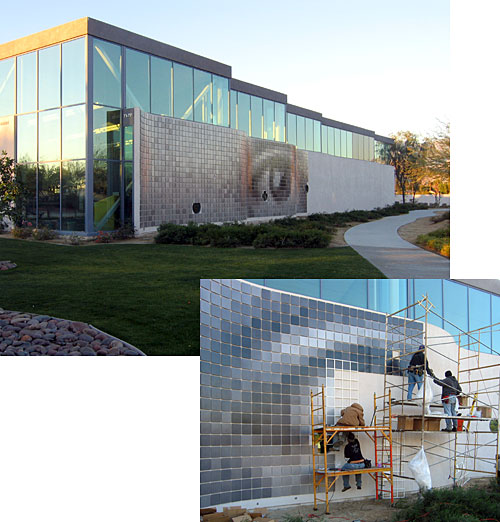
Ben and I have spent the last week in Rancho Mirage, California, overseeing the installation of the mural we have designed for MGA Partners, Architects’ Children’s Discovery Museum of the Desert. Consisting of over 4,000 nine inch square aluminium tiles, the mural has a base image of eyes, the predominant mechanism of discovery, to create an inviting facade for visitors. Over time, each of the gray tiles will be replaced by a donor portrait, carefully matched in overall density to the tile it will replace, keeping the base image intact. Thus an initial image without any indication of age, gender, or ethnicity will be seen on close inspection to be a muticultural mosaic of the Museum’s visitors. If you are interested in becoming a donor, or sponsoring a child or family member, the cost of a tile is only $225, and is a fully tax-deductible contribution. You can contact the Museum for details. We will be returning to the Desert in a few weeks to oversee the installation of the first portraits and will post pictures of the completed mural at that time.
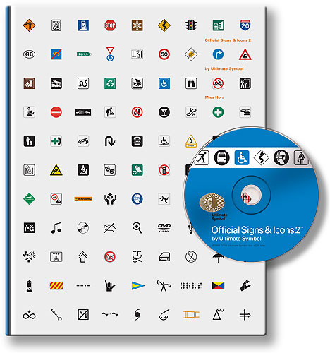
For those of us who have to deal with symbols and icons on a regular basis, and there can’t be many of us who don’t nowadays, Mies Hora’s new publication Official Signs and Icons 2 is a wonderful resource. It comes both as a book and a CD (containing outline EPS files) which you can buy separately or as a set.
In eleven chapters, it brings together in one volume, pretty much every symbol you will ever need to wrestle with, including highway and transportations signs, safety symbols, recreational symbols and some nerdy stuff for electronics, computers, meteorology, and labelling. Most fun is the chapter which shows each character of the alphabet in signal flags, semaphore positions, Morse code, American Sign Language, and Braille.
There have been several such books published from time to time since Henry Dreyfus’ 1972 Symbol Sourcebook, which still contains the most fascinating and esoteric selections, such as hobo signs. But for symbols with everyday applications, if you aren’t planning to jump a freight train, Mies has excelled himself in putting together this exhaustive collection (although I must admit I gave him a little help with some of those relating to accessibility).