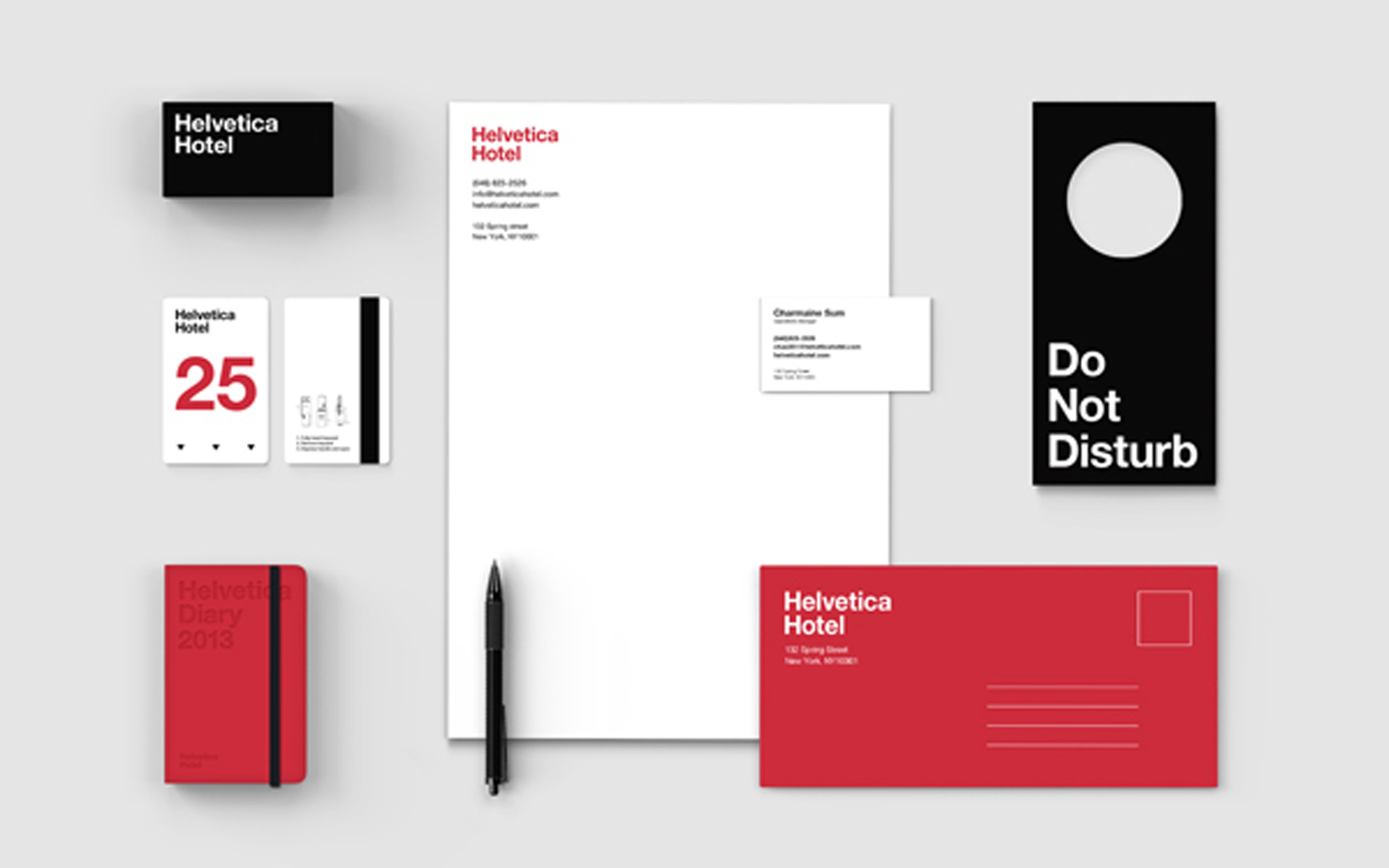
Today, it is almost a shock to see the sort of striking minimalist design that was probably most associated with Massimo Vignelli in the Sixties. It is a reminder that a simple typographic system and color palette, expertly used, can hit you right between the eyes a lot more effectively than many of the graphic gymnastics we are now more familiar with. This Helvetica Hypothesis, by designer Jung Hwan shows how it works.
Category: Geekery
If you can’t make it to the SEGD national conference this year or want to see what we are up up to in D.C., you might want to follow the Whitehouse & Company Twitter feed. We’ll be updating throughout the event and bringing our unique view of the show.
There will also be tons of spelling errors, because there is no spell check on the iPhone, so you’ll have that to look forward to as well.
Let’s get environmental.

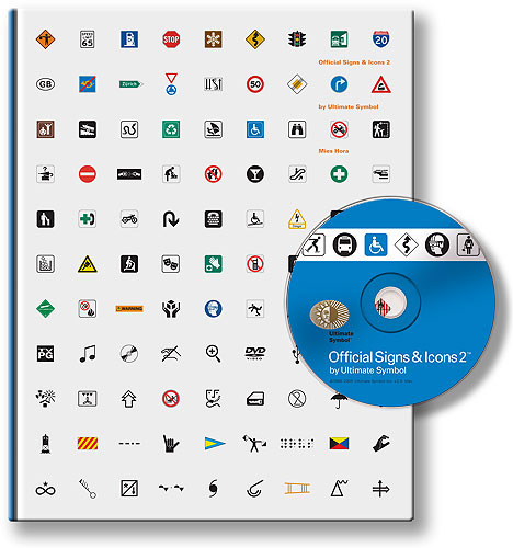
For those of us who have to deal with symbols and icons on a regular basis, and there can’t be many of us who don’t nowadays, Mies Hora’s new publication Official Signs and Icons 2 is a wonderful resource. It comes both as a book and a CD (containing outline EPS files) which you can buy separately or as a set.
In eleven chapters, it brings together in one volume, pretty much every symbol you will ever need to wrestle with, including highway and transportations signs, safety symbols, recreational symbols and some nerdy stuff for electronics, computers, meteorology, and labelling. Most fun is the chapter which shows each character of the alphabet in signal flags, semaphore positions, Morse code, American Sign Language, and Braille.
There have been several such books published from time to time since Henry Dreyfus’ 1972 Symbol Sourcebook, which still contains the most fascinating and esoteric selections, such as hobo signs. But for symbols with everyday applications, if you aren’t planning to jump a freight train, Mies has excelled himself in putting together this exhaustive collection (although I must admit I gave him a little help with some of those relating to accessibility).
As a graphic designer living in New York on a limited budget, I am constantly looking into catalogs and magazines, and drooling over the well designed objects I might someday afford. The Aalto vases, the Eames lounge chairs with ottomans, the Akari Noguchi paper lamps — all these items ignite my interest, but their prices bring up every designers biggest dilemma, design or Dinner?

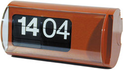
One such object is the famous Solari Cifra 3 table clock. Manufactured by Solari in 1965 and designed by the flip (or flap depending on your preference) clock master Gino Valle, the Cifra 3 is often referred to as the “museum clock” as it was sold exclusively by MoMA. Gino Valle was an accomplished designer in his own right designing numerous flip clocks for Airport terminals, most notably his Monumental flip clock at TWA terminal.
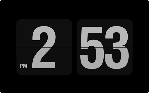
Unfortunately, the Cifra 3’s, while still produced, sell for well over $200, which is a little out of my budget. Solution — make your mac (or PC) into a Solari Cifra 3 clock for free in approximately 2 minutes with an elegant little screen saver from 9031.com

The screensaver turns your idling computer into a wonderful timepiece. The only thing this clock doesn’t do, which is a real pity, is make a flapping sound as time passes. The Cifra 3 makes a small “flap” with each passing minute and a large “chunk” every hour as every flipper turns over simultaneously to display the new hour… although that might drive some folks crazy.
For more design hacks visit Twart Design’s Design w/o Reach for some low tech answers to high design.
Lezioni Design biography – translated
Artnet Biography of Gino Valle
Solari’s Story
Design Addict’s profile on the Cifra 3

