Categories
Design Everyday

Cute, But Not Kitsch

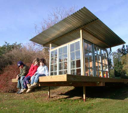
In England, we call these things Wendy Houses, so named because Peter and the Lost Boys built Wendy a little house in Peter Pan. In the US they are rather unpoetically referred to as just playhouses. At least I think so, we built one for our daughter Amy, and we called that Amy’s house (although she only went into it twice and it now houses decaying headless Barbie dolls and crawly things with excessive numbers of legs). While usually an opportunity for unrestrained kitsch and revolting cuteness, I thought this example both witty and of considerable charm. Particularly gratifying is that it is in this year’s Royal Academy show in London, organized by my old flatmate Peter Cook, who has been encouraging some new and younger talent to submit projects. It was designed by Amir Sanei (who studied at the AA like myself) and Abigail Hopkins (who studied at Columbia, where I later went on to teach).

Their Website www.saneihopkins.co.uk
Categories
Design Ephemera

New Target Pill Bottle

Target Pill Bottle
The New Target Pill Bottle

Medicine bottles are stupid and dumb. So are regulatory traffic signs, remote controls, cell phone interfaces, and the flushing mechanisms in toilets. Occasionally designers are hired to make them beautiful and dumb. Once in a blue moon, designers get it right. The new Target medicine bottle is one of those brilliant designs which make so much sense everyone must now be wondering why medicine bottles weren’t always like that. It is also great-looking, not through styling but as a result of good old form-follows-function clarity. Designed by Deborah Adler, an SVA student (who now works for Milton Glaser), as her thesis project, the new bottle sits cap downward to provide a large flat surface for clear graphics, features a pull-out card for personal and cautionary information, and is provided with changeable color-coded neck rings to distinguish drugs intended for different family members. Why is it so difficult for manufacturers to apply this kind of common-sense good design to all of those other infuriating objects that constantly frustrate us?

Categories
Design Ephemera Everyday

Help Stamp Out Over-cropping

Stamps

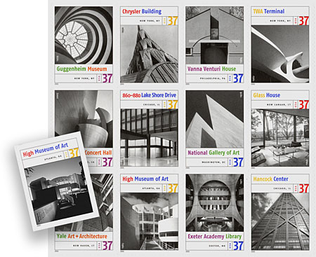
The Post Office have just released this series of Masterworks of American Architecture stamps, which is nice, although the cropping of most of the images leaves little of the architecture to appreciate. Particularly egregious is the fact that they cropped out our graphics for Richard Meier’s High Museum. We have solved that by redesigning that particular stamp for you (go on, you can see our graphics if you look hard enough). If you want to see more…

Categories
Design Everyday Web

Usernames Are So 1996

I’m sure it’s happened to you at some point, you visit a website that you registered with, maybe your company’s healthcare provider, but you’ve totally forgotten your username and password. If you’re anything like me, you have a few usernames you’ve used over the years and a few passwords you might have used, but which ones are they? A few minutes of trying and I usually give up and ask for my username and password to be e-mailed to me.

Usernames

This scenario happens to me over and over again and I never seem to get used to it. Is there another way? Are usernames really the best method for registering users?

Categories
Culture Design

(One of) My Favorite Architect(s)

Lois Kahn
Louis Kahn at the AA.

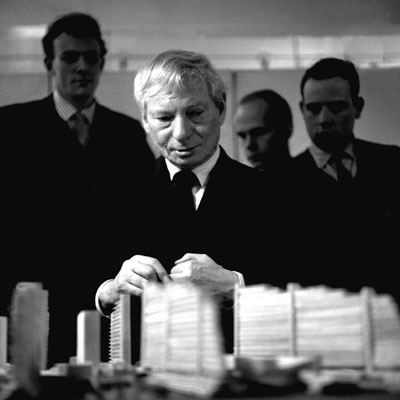
I discovered this while rummaging through my computer this morning. I think I must have taken the photo in 1962 or thereabouts, when Kahn visited the Architectural Association and reviewed our fifth year projects. I can’t remember now what he said about my particular attempt (a utopian and megalomaniacal redevelopment of the South Bank in London), but I recollect it did go on to be ‘stored’, which meant it was put into the AA archives. In any event it was a wonderful experience to have been able to meet the author of some of the most sensitive and significant examples of modern architecture. He was a certainly a profound influence on my architectural work (before I defected into graphic design).

I have since donated the negatives of this and a companion shot to the Penn Architecture Archives in Philadelphia.

Categories
Design Everyday

Congratulations, Jasmin.

Jasmin Thesis

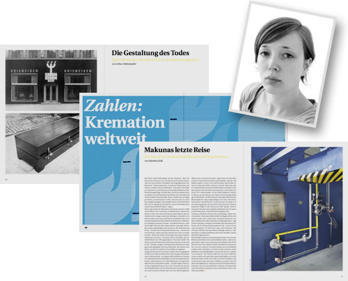
Four years ago, a German high school graduate with no previous experience but with an avid passion for design knocked on our door looking for an internship for the Summer. Her prodigious talent was immediately apparent, and in the few months she was with us we were glad to be able to help a little with her application to design school in Berlin. Now she has graduated with this accomplished monothematic magazine about funerals as her Thesis. Congratulations again Jasmin Mueller-Stoy, Diplom Designer.

Her website www.muellerundstoy.de.

Categories
Design Ephemera Everyday

Signs of Civility

Park Neatly

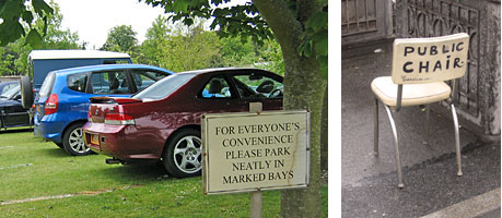
Photographed last month, just outside Chichester (UK) and in Greenwich Village (NY).

Categories
Design Everyday

The Light Stuff

Fifth Avenue Light Post

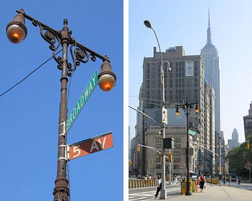
I seem to be on a street furniture bender this week, but in case you hadn’t noticed, there is still one genuine (not cutesy-poo pastiche) early Fifth Avenue lamp post standing alone, albeit overshadowed by an aggressive cobrahead, facing the Flatiron Building at 23rd Street and Broadway. This particular design dates from the early Twentieth Century, and had replaced an even earlier and more ornate gas fitting featuring massive hanging globes. Sadly, there are cables taped up it and a discarded Heineken bottle jammed in the access panel at the base. I believe that this is the last remaining example and yet it seems to be treated with casual disregard rather than being recognized as a real piece of design history. Shame on us.

Categories
Design Everyday

To be Continued …

walk to next sign

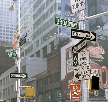
Being located in Times Square, it seems entirely appropriate that the newspaper convention of continuing the story on the next page should have been appropriated by the Department of Transportation in the context of regulatory signage.

Categories
Culture Design Events Everyday

Ashes and Snow and Sonotubes

Ashes and Snow

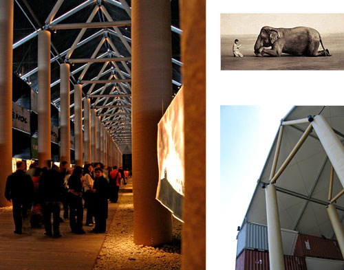
Having seen the elephant photo all over the place for some time, Saki and I hurried over to Pier 54 to have a look at Ashes and Snow for ourselves before it closed and were amazed. What most impressed was Shigeru Ban’s structure. I was expecting a pile of shipping containers with some photos on the wall. Instead I found one of the most exciting and awe inspiring spaces that New York has ever had to offer, and like the Central Park Gates project, it wasn’t around for long (it is now all being shipped to California). First of all, this thing is huge! On entering you found yourself in a fabulous, dark, ethereal, and seemingly endless cathedral space stretching a full City block out into the Hudson. While constructed of shipping containers, sonotubes, canvas, and steel cable, with a floor of wooden planks and river stones, it has all the authority and majesty of any cathedral nave you have ever visited. Truly wonderful and a must-visit if you encounter it on your travels.

The photos I was less enthusiastic about. While there is no denying that many of these images are stunning, the more I saw the more I felt uneasy about the apparently contrived posing and what to me seemed an intrusively “arty” presentation. If these had been paintings (which they nearly are) I think they would seem the epitome of Shmaltz and the fact that they are photos does not ultimately redeem them in this respect. One would love to think that the child had innocently happened upon the elephant and stopped to consider it, and that the photographer had innocently (or purposely) happened upon both. But that not being the case what we end up with seems somewhat unsubstantial.

But that’s just my opinion. Do not miss out on the chance to see for yourself.