Categories
Everyday

Goodbye and Hello…

Whitehouse and Company (WandCo) is no more.

If you seek experiential graphic design services, Ben Whitehouse is a Creative Director at Two Twelve NYC.

Roger and Helga are enjoying jet-setting between New York and San Miguel de Allende, Mexico. Feel free to say hello.

Categories
Films

The Last Ice Merchant (El Último Hielero)

A gorgeously shot short film about Baltazar Ushca who has harvested ice traditionally from Ecuador’s Mount Chimborazo for over 50 years.

TheLastIceMerchant.com

Categories
Events

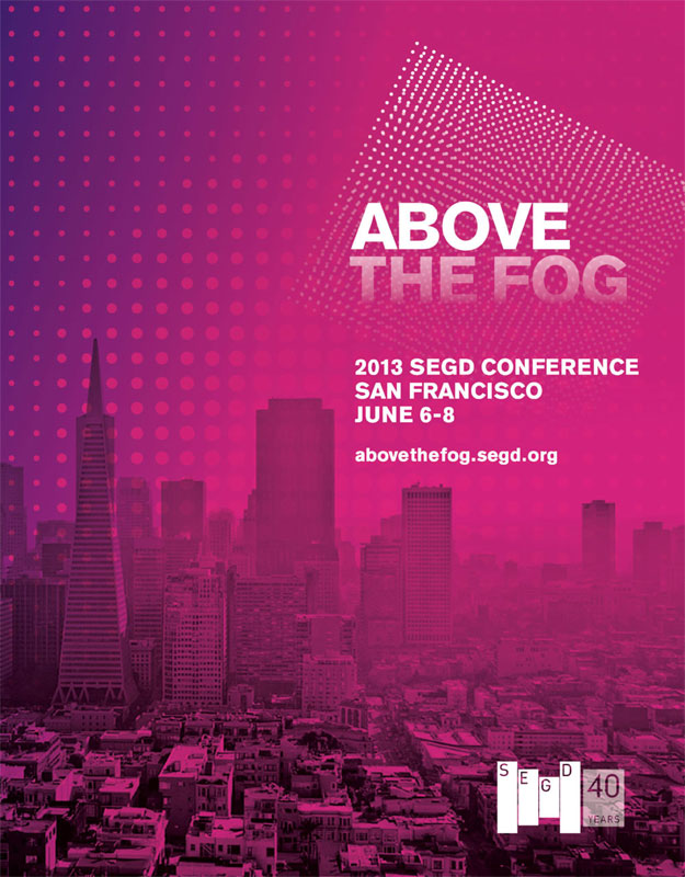
Off to SEGD 2013 in San Francisco

SEGD-2013-Cover

While I head off into the sunset to the 2013 SEGD conference in San Francisco, the New York studio will be manned by Roger and staff to answer all pressing client issues. I’m excited to be back in San Francisco – one of my favorite best coast cities. Unlike Los Angeles, San Francisco understands what it is to live in a city with occasional crappy weather. Call it what you will, it makes the citizens a much more relatable bunch than those farther south, who can’t truly appreciate the urgency to enjoy good weather.

Categories
Events

Design & the Senses

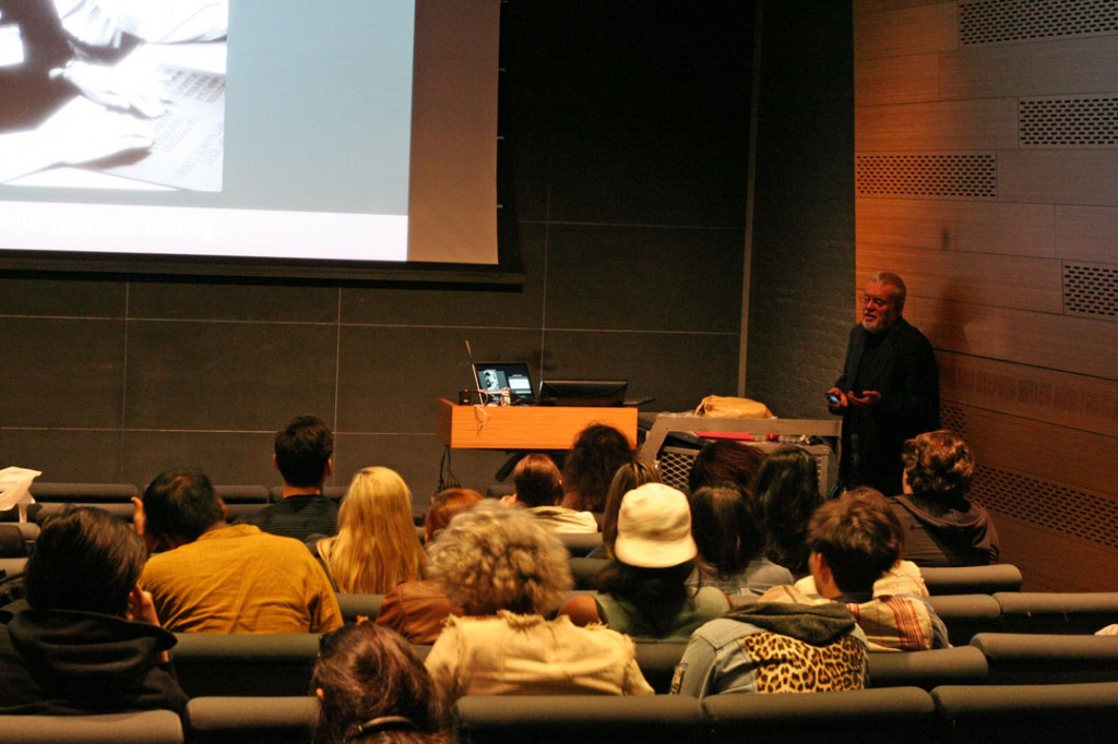
Today Roger Whitehouse spoke to current students and faculty at Parsons School of Design in New York City. He discussed how lessons learned at The Lighthouse project, in New York, were invaluable to understanding that perceptions on how people encounter spatial environments are not universal.

Roger Whitehouse Speaking at Parsons

Categories
Software

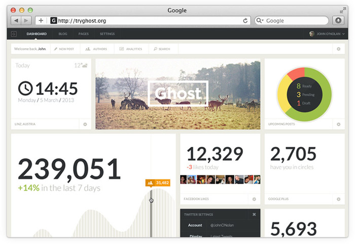
Ghost – A Blogging Platform

Ghost Screeenshot

At Whitehouse & Company we believe in Open Source technology. We use WordPress for almost every website we design as it is a rock solid CMS which allows our clients to actually use their websites to interact with audiences, rather than create static experiences.

WordPress started, back in 2003 when we were still using the free blogging system Movable Type. Unfortunately in 2004 Movable type decided to tighten their licensing and start charging for use of their software and stop distributing a free version. This fundamental change made us jump ship and swim over to WordPress, which at that point was a huge switch in our process. We had never fooled around with PHP and having to learn, albeit superficially, a programming language was a huge undertaking for busy graphic designers. Movable Type later realized the error of their ways and created a free version for personal use, but by that point it was too late, we were addicted to the open source WordPress. Almost 10 years later we are still happy WordPress users and have donated, on behalf of ourselves and clients, hundreds of dollars to the application’s development.

However, WordPress is now arguably more CMS than blog software. For our client’s professional sites, this is a good thing, but when you compare WordPress to the ease of use of Tumblr for blogging, it falls short. It lacks the “get out of your way” mentality that Tumblr uses to spotlight content and spur conversation. WordPress is a wonderful website creation tool, but as a blogging system — it is a little overwhelming for a quick post. Tumblr, however, is not open source, nor can it be hosted on your own server and the content owned exclusively by you.
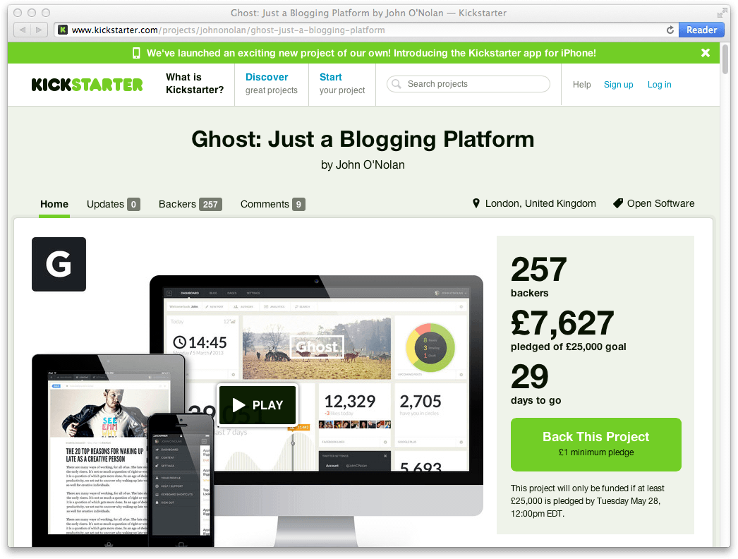
Ghost Kickstarter screenshot

In light of this, and in the interest of supporting options in the Open Source community, today we have backed the Kickstarter campaign for Ghost, a new platform for blogging. It looks both beautifully designed and elegant. Best of all, Ghost will be free (if fully funded) for anyone to try, use, experiment and most importantly — express themselves.

Give it a look, and if you agree with their mission, donate a few pounds… they’re English.

Update

Even in the short space of time from yesterday to today, the Kickstarter has rocketed from £7,000 when we funded it, to an impressive £45,000. So it looks like Ghost will be a successful reality for everyone. They are still raising money and if they raise enough they will add benefits to supporters. Go help them out if you haven’t already.
Categories
Web

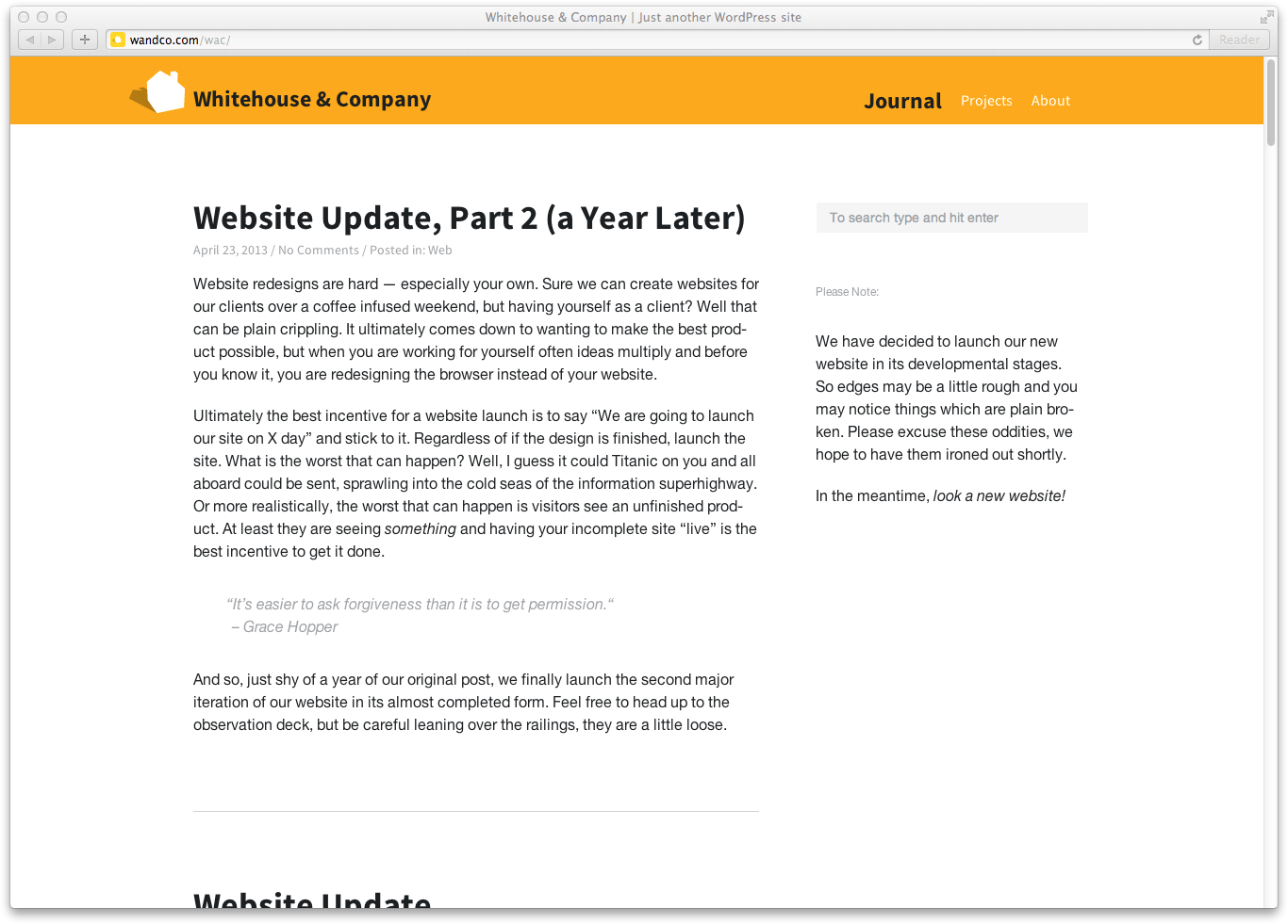
Website Update, Part 2 (a Year Later)

Website Update Part 2

Website redesigns are hard — especially your own. Sure we can create websites for our clients over a coffee-infused weekend, but having yourself as a client? Well, that can be plain crippling. It ultimately comes down to wanting to make the best product possible, but when you are working for yourself often ideas multiply and before you know it, you are redesigning the browser instead of your website.

Ultimately the best incentive for a website launch is to say “We are going to launch our site on X day” and stick to it. Regardless of if the design is finished, launch the site. What is the worst that can happen? Well, I guess it could Titanic on you, and all aboard could be sent sprawling into the cold seas of the information superhighway. Or more realistically, the worst that can happen is visitors see an unfinished product. At least they are seeing something, and having your incomplete site “live” is the best incentive to get it done.

“It’s easier to ask forgiveness than it is to get permission.”

– Grace Hopper

And so, just shy of a year of our original post, we finally launch the second major iteration of our website in its almost completed form. Feel free to head up to the observation deck, but be careful leaning over the railings, they are a little loose.

Categories
Web

Website Update

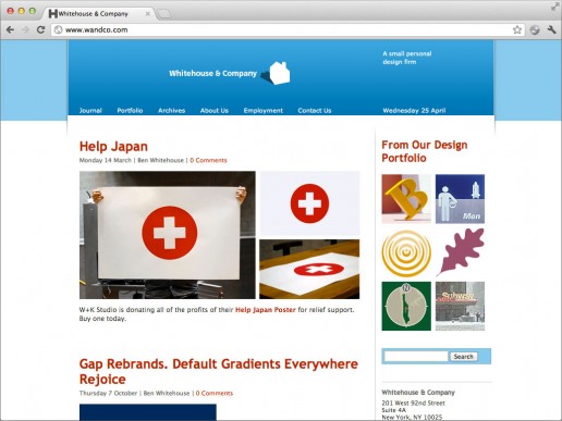
The original site – for posterity.

Back in 2002, the web was a fairly volatile place. Web standards had just been introduced, and the internet was in flux with new coding strategies and methodologies. Since 2002 we have seen incredible advances in both the way websites are made as well as a substantial change in what they are made out of.

This website was originally designed in 2002. It was, at the time, pretty cutting edge using WordPress as its internal content management system. Now in 2012, that is standard practice for most websites on the internet. As such we have decided at Whitehouse & Company to redesign using the latest standards, HTML5 and CSS3. To bring our blog and portfolio into the twenty-teens.

It is something we are very excited about and a journey we will share in posts about what we learn along the way.

Categories
Everyday

Help Japan

W+K Studio is donating all of the profits of their Help Japan Poster for relief support. Buy one today.

Categories
Opinions

Gap Rebrands. Default Gradients Everywhere Rejoice

Dropping its time tested and 20 year old logo, The Gap (now simply GAP) has re-branded with what may be the most boring re-brand since… ever really. Dropping their iconic stretched serif logo for one which is remarkably like American Apparel’s logo (also Helvetica, also black, and also tightly kerned)

What I find most confusing that during this economic decline, why they would decide to throw out something which will require millions of dollars in new signs, promotional materials, clothing labels, etc. Not to mention as environmental graphic designers, we have no idea how one might apply this mark 3 dimensionally without creating a fairly ugly sign box for the gradient?

All in all, we are not impressed with GAP’s re-brand and think it’s more of a marketing stunt (Ala Tropicana’s terrible re-brand of months back) than an actual graphic design solution.

Categories
Events Geekery

2010 SEGD Twitter Updates

If you can’t make it to the SEGD national conference this year or want to see what we are up up to in D.C., you might want to follow the Whitehouse & Company Twitter feed. We’ll be updating throughout the event and bringing our unique view of the show.

There will also be tons of spelling errors, because there is no spell check on the iPhone, so you’ll have that to look forward to as well.

Let’s get environmental.