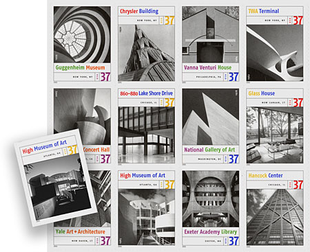
The Post Office have just released this series of Masterworks of American Architecture stamps, which is nice, although the cropping of most of the images leaves little of the architecture to appreciate. Particularly egregious is the fact that they cropped out our graphics for Richard Meier’s High Museum. We have solved that by redesigning that particular stamp for you (go on, you can see our graphics if you look hard enough). If you want to see more…
2 replies on “Help Stamp Out Over-cropping”
I just did a photography site for a friend and ran into this cropping issue in her gallery. The Flash gallery I purchased for her was not flexible enough to expand in height when there was a tall photo, so I had to scale her stuff down to fit the 640 x 440 window. The result was that she lost both interesting details AND drama. Yes, I could include the whole photo, but it was almost pointless. I think there are times when cropping the photo makes sense on a small scale so that people can at least see SOME of the beauty of it. Maybe I’m missing your point…
Actually, I agree with you. If you are looking at our actual site rather than an RSS feed, you will see this in the extreme in some of the thumbnails we use for our projects. The point I was making here was that for a series of photos illustrating architecture, some of the photos such as Philip Johnson’s glass house are so cropped that you are seeing a window detail, and have no sense of the building. That is fine as a teaser to lead you to the whole thing on a website, but a doubtful idea in the way used here. Additionally, having worked designing books with some of the photographers of the stamps, I know they are adamant that their photos retain the original cropping they so carefully considered.